Empty States – the overlooked UX-Hero
What could make a better topic for my first entry than ... empty states?

Empty states are often overlooked or forgotten in the design process, but they can be real drivers of substantial value, and if done right, contribute to an overall more compelling user experience.
What Is an Empty State?
Empty states they moments in a user’s experience where there is no content or data to display (yet). This can happen when a user opens an app or website for the first time, tries to search for something but gets no results or experiences a hiccup while using the interface.
Take for example a messaging app. If you initially open the app, there is no message yet. There are multiple options how such a state can be handled.
Empty space can be considered a way to communicate with the user about something useful for example an action to resolve the empty state. A thoughtfully designed empty state helps guide the user and offers a straightforward direction to proceed, whereas a poorly designed empty state can lead to confusion or frustration.
Types of empty sates
As mentioned there are different types of empty states. Here are 3 of the most common types that I found in the projects a work in before:
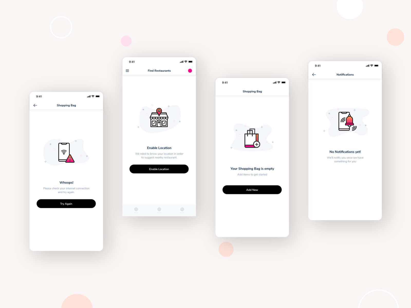
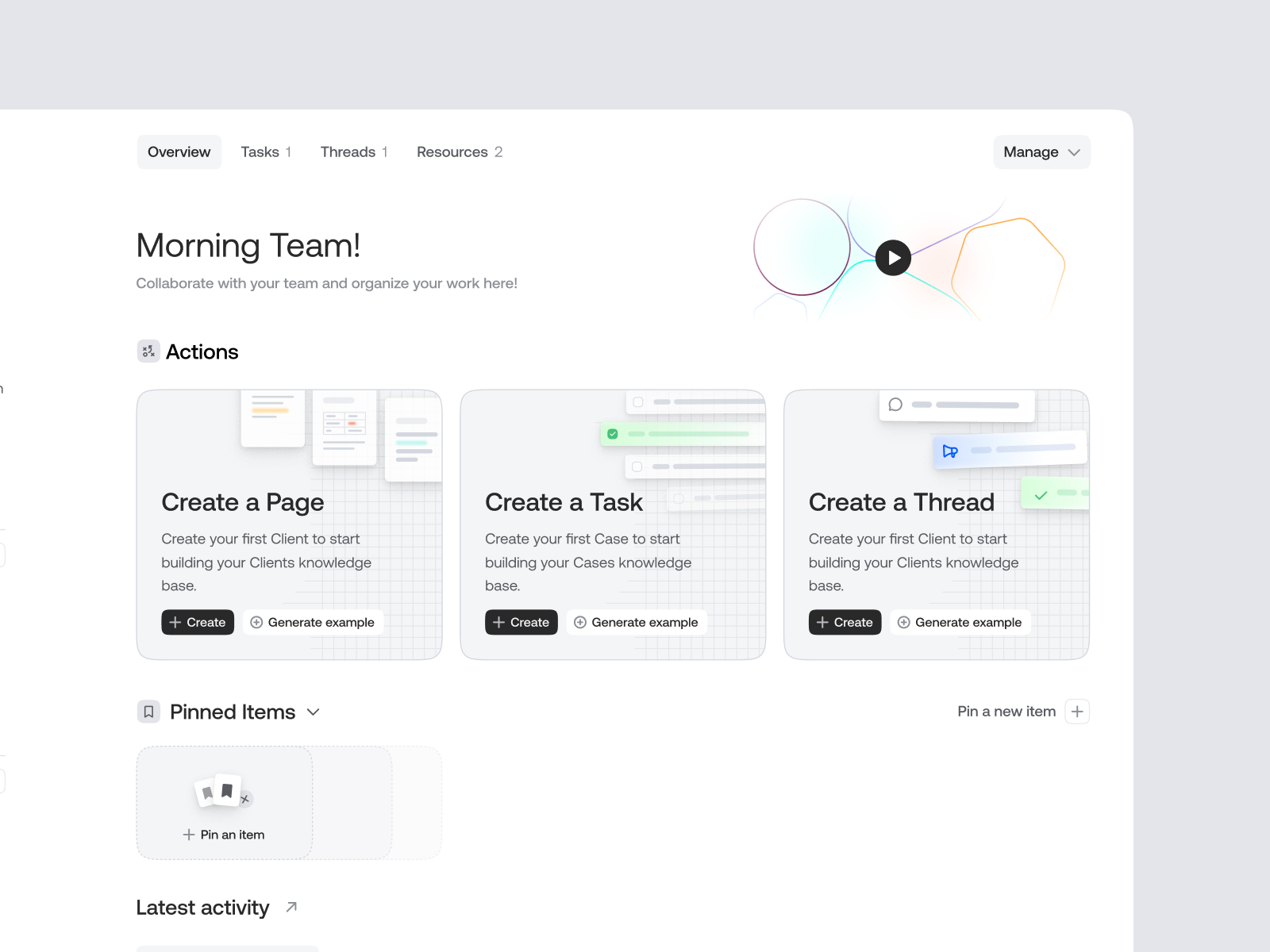
- Initial empty state: This empty state displays when an application or website is opened the first time by a user and has no content to display. For example Starting a new community account and having no connections yet.
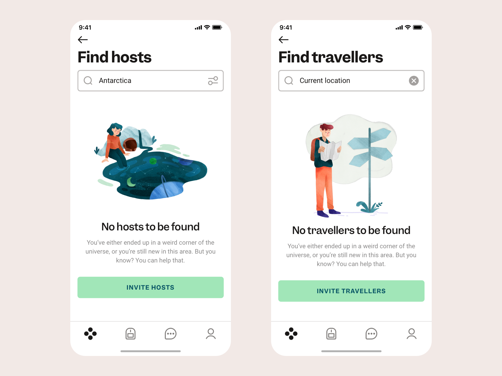
- Empty search results: When a user performs a search and no results are found. For example searching for something in your email tool and obtaining no results.
- No internet connection: Occurs when the user does not have an internet connection and therefore cannot access content of functions.
How Does Empty State Impact the UX
There are multiple ways in which a well-designed empty state enhances the user experience of your application.
- Effectively communicates the purpose of the current screen By utilizing an empty state, users, especially those who are new to the application, can easily grasp what the application does and how it can be utilized.
- Provides guidance to the user The empty state suggests actions that users can take to access the desired content, such as performing a search or creating a new item. This reduces confusion and helps users understand what steps they can take next.
- Helps prevent frustration When an empty state is poorly designed, it can confuse or frustrate users, resulting in a negative impact on their experience. A well-designed empty state minimizes frustration and contributes to an overall positive experience within your application or website.
Tipps for better empty states
-
Communicate Purpose: Use the empty state to explain the application’s purpose and functionality.
-
Suggest Actions: Provide actionable suggestions for users to populate the interface with content, like searching or creating new items.
- Encourage users to utilize the search feature to find desired content.
- Prompt new users to create content and populate the interface.
- Provide an option for users to discover other features.
- If content relies on external sources, guide users to connect and retrieve data.
- Offer assistance by suggesting users reach out to support for any issues.
-
Utilize Visuals: Incorporate illustrations or imagery to aid user understanding and prompt desired actions.
-
Keep Design Simple: Avoid clutter by focusing on key messages and actions, using a clean layout with a title, description, image, and action.
-
Consider Context: Design the empty state to align with the specific context, such as displaying relevant messages and alternative actions based on the situation.
-
Validate with Users: Gather feedback from real users to improve the empty state design.
Examples of good empty states

https://dribbble.com/shots/11553614-Empty-States

https://dribbble.com/shots/21281058-Team-page-empty-state

https://dribbble.com/shots/14298932-Empty-States
Conclusion
Even when overlooked before (I do it all the time… 🙄) try to start your designs with an empty state and continue from there.
Bonus: I created my own little checklist to remind my self of important that might otherways get missed. Its based on this one here: https://www.checklist.design/
